URBAN PEARL
YOGA

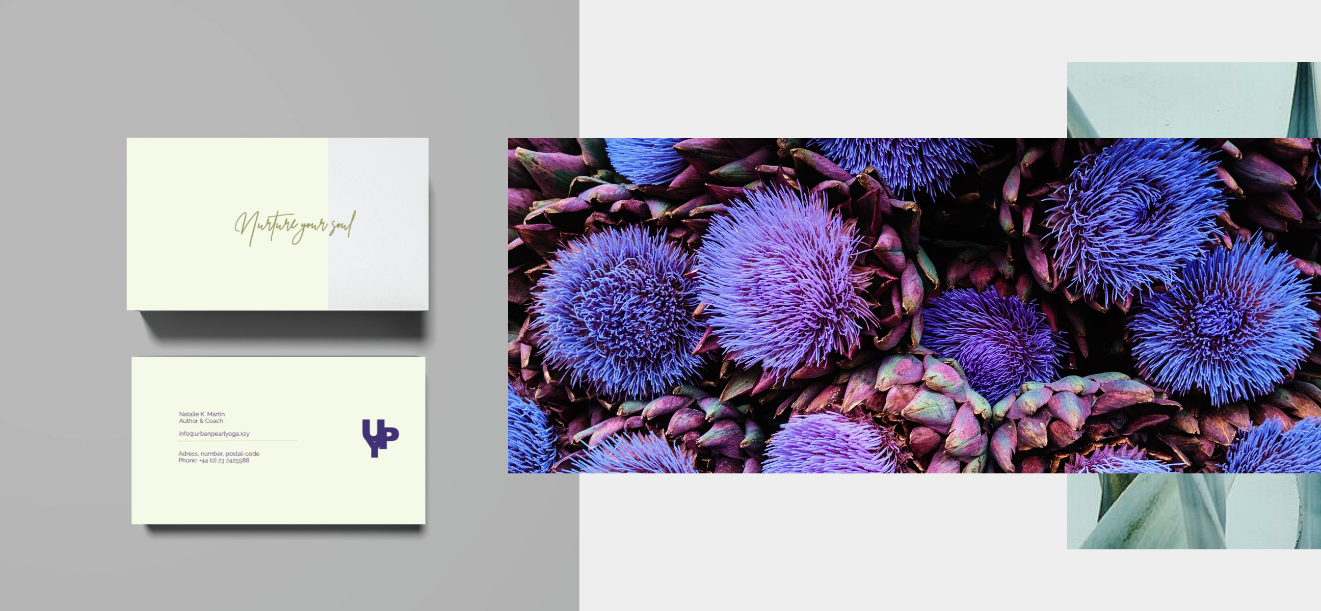
 Urban Pearl Yoga aimed to create a serene space for inner peace and strength, desiring a refined visual identity that echoed the sanctuary they offered. They sought a brand voice that was gentle yet forthright, exuding a sense of reflection and attention to detail.
SERVICES
COMPETITIVE POSITIONING
PERSONA BUIDLING
BRAND IDENTITY
LOGO DESIGN
YEAR
2019
Our journey with Urban Pearl Yoga began with an extensive dive into the competitive landscape, conducting thorough analysis and building detailed personas. Understanding their distinct positioning in the online studio realm was pivotal.

Moving forward, we crafted a visual brand identity focused on serene aspirations. Before defining the rich color palette—composed of cool tones with subtle grey undertones and deep primary tones —we meticulously refined the brand voice.

It reflected a sense of clarity and formed a unique identity that resonated with the sanctuary's soul. Through a blend of competitive analysis, strategic persona building, and meticulous design, we not only crafted a brand identity but also positioned Urban Pearl Yoga as a tranquil haven in the midst of the loud urban city jungle.
NEXT